TEAM WORK WITH: José maría olvera & sergio lozano.
MY ROLE: product design lead
The following project was carried out for a NEO Bank for Mexico in 2021.
OVERVIEW
Some people do not launch an app to spend time learning about how to use it, but rather to complete a task in a short time using the least amount of effort. On the other hand, this is not happening all time, others users get logged and by inertia, their first action is to understand how things work, if it’s difficult they leave and never return.
Don’t sit down and wait for the opportunities to come. Get up and make them.
- Madam C.J. Walker
Many brands make their Help Center a priority because it’ll become the first line of defense against an overload support system, to help avoid this they emphasize two areas: ease access and clear information.
OBJECTIVE
BUSINESS
Increase the number of people who solve their questions with the use of the Help Center within the bank's application, resulting in faster responses, self-service and the reduction of requests to the support team.
DESIGN
Design a module capable of centralizing all the help functions of the different services offered by the banking application. This must be visually appealing, highly usable and ultimately attractive.
HYPOTHESIS
If we offer a more complete help service, that can be dynamic to different circumstances; then we can attract users, solve their doubts and improve our percentage of loyalty index (NPS).
DISCOVERY
CURRENT PRODUCT ANALYSIS
As a first step, we had to understand what we had and for what reason it was not providing support to customers, since out of 10 users who entered, 9 contacted an agent.
FINDINGS
It is not possible to maintain a static help center for the different stages that the user lives and also considering the products that he has contracted
It is of great importance to approach the customs and needs that each country faces (MX, CO, PE, & BR) in our new interface
PAIN POINTS
The content was not comprehensive, therefore was not capable of answering customer’s common questions
Some information was also outdated, making it hard to get a proper solution
The organization and the allowance of some features change related to the phone operating system
LIGHTNING DEMO
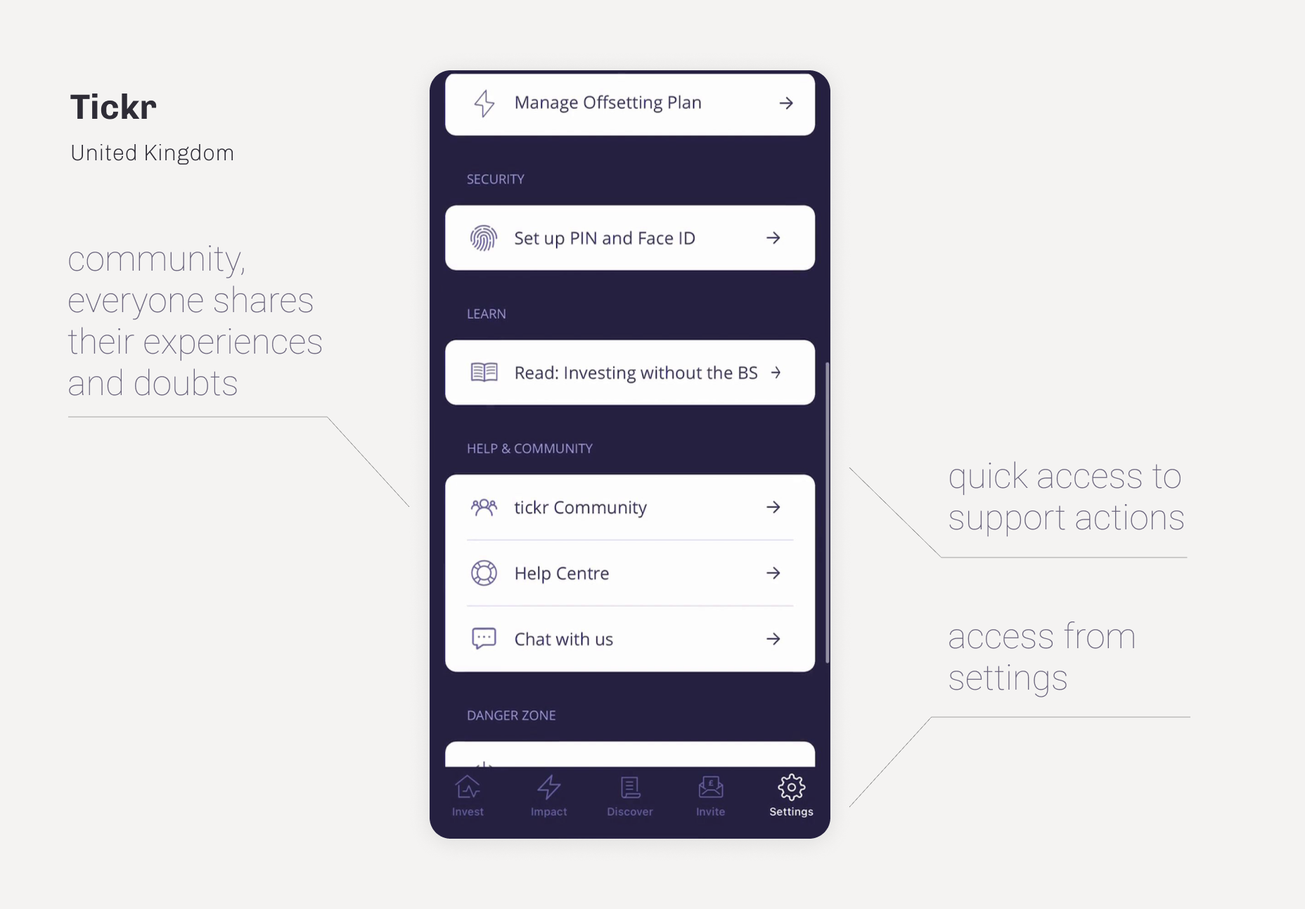
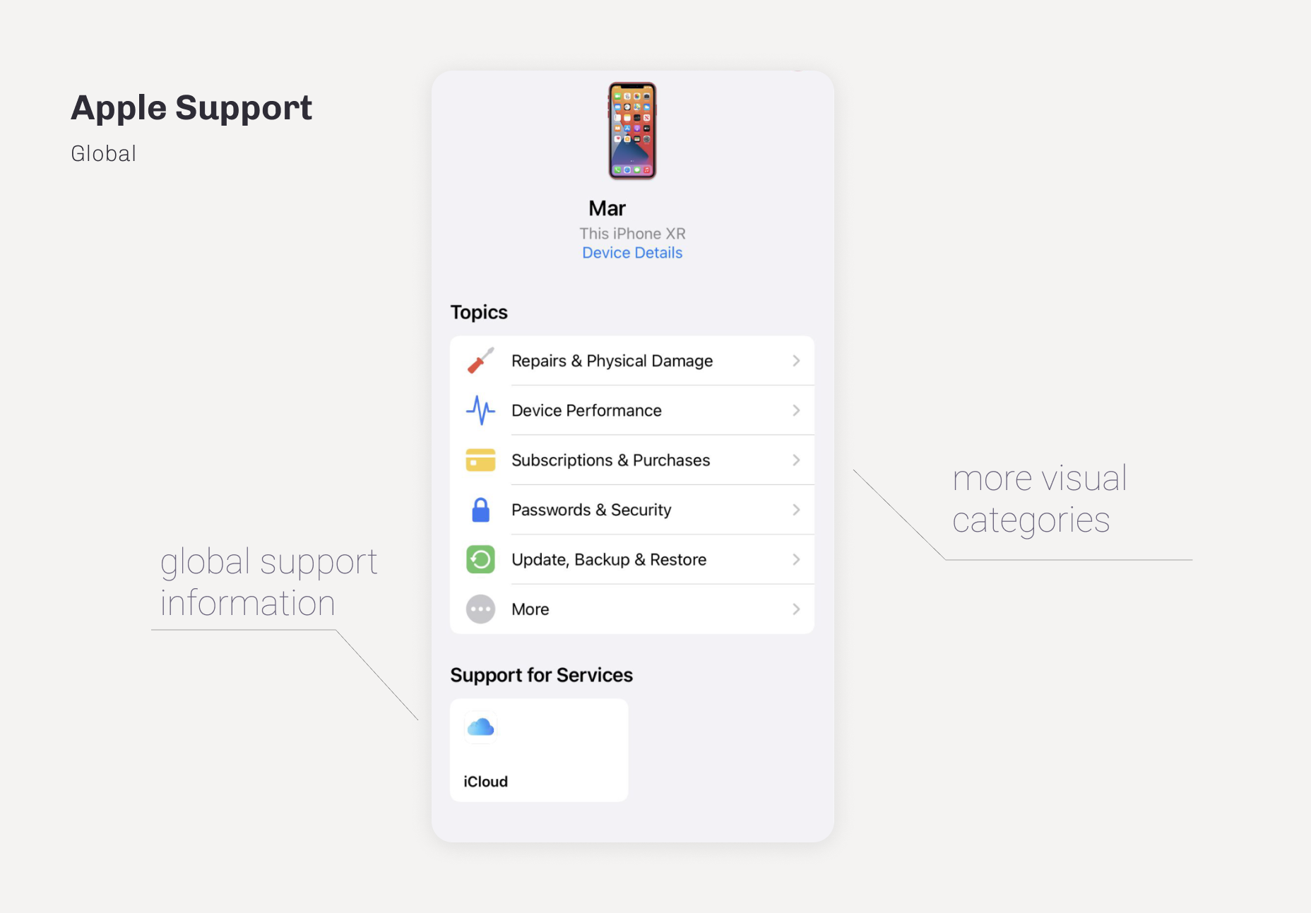
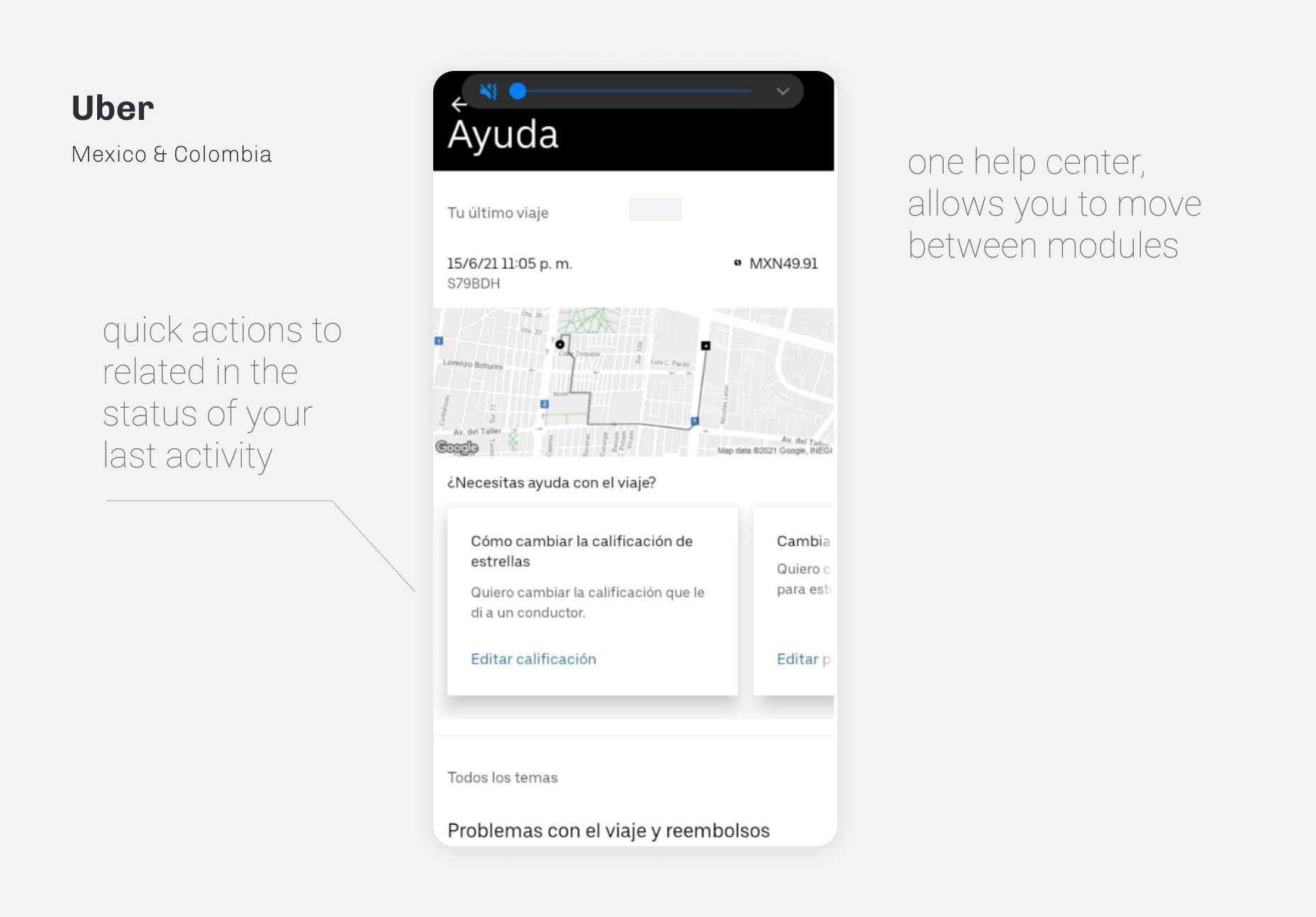
This is an exercise to inspire your team with products or services that they think they can use as inspiration for their concepts in the next phases of their design sprints.
Value points
Access to a search tool when accessing the help center
Two steps to access contact options
Contact, reports, and previous search history
More visual and understandable categories for users
Catalog with tutorials on how to use the functions
GROUP SESSION
We meet with different profiles such as agents, developers, stakeholders, etc. in order to learn about their experience when contacting support and using help centers for other services . This helped us understand in more detail What is a good customer experience?
USER EXPERIENCE
Once the investigation is finished, it is time to give way to experience improvement, to achieve that we study the previous flows and incorporate the findings in to the new flows.
USER FLOWS
Understanding the operation of the help center, we found that a static module was not going to be fully functional. In the first place, because the needs of someone who is barely registering are different from those who already has the product, adding to the conditional, the variability introduced by country in structure and information.
SKETCHING - CRAZY 4
Working remotely causes many team decisions to be lost , as well as some lose motivation to participate. To address the situation we implemented Crazy 8, an activity where everyone has 1 minute to draw a proposal on a particular topic. This helped so that everyone could express their ideas while visualizing the interface. By the help of FigJam we were able to vote and react to each other sketch, at the end we take the best assets of every proposal to move them into the final mockup.
UI DESIGN
Once we settled down on an ideal structure for the experiences, we move on to the visual detail. Making use of the platform’s existing library of components we create a first attempt of interface. It was not perfect, so keeping in mind the lightness of information, as well as maintaining a cleaner design, we decided to work in a second attempt where we did a research and modifications to our style.
BENCHMARK STYLE
* Dribbble and pinterest references
SCREENS
* The following project was carried out for THE SUPER APP RAPPI in its section RAPPIPAY. The detailed experience in this use case will be available when requesting any of their banking products.
Following the previous steps we end up with a mature flow for the app that has at its core the ease of use and the customer experience as priority.


NEXT STEPS
test the proposal
No job can be closed without having results, reason why this project will be tested to measure the user’s perspective in relation to the implemented features as well as the availability of information.
Once the results are obtained modifications will be made if necessary to later be scaled to development team. It is important to note that once it is released, the CX team must provide a before and after comparison in statistics to the support team.


