TEAM WORK WITH: OSVALDO RIVERA.
MY ROLE: UXER AND VISUAL DESIGNER.
The following project was carried out for a FINTECH related to payroll for Mexico in 2020.
OVERVIEW
The registration of an employee today is complex and confusing given that there are different ways to complete this action (individually or massively) in the App. It should be noted that each one has variations in structure and requested information, thus generating that the process is mostly carried out by an internal team of agents.
“It’s not always that we need to do more rather that we need to focus on less”
- Nathan W. Morris
Our emphasis will be on the bulk registration of employees, where one of the main causes of error is the use of excel, which cannot be limited in structure or format, which allows the user to take actions that affect its processing.
On the other hand, this process requests a large amount of mandatory data that must be registered at the time, in order to have an impact on the services contracted by the client on the platform, resulting in the entry of false information or a partial registration.
In search of reducing friction and the time invested to complete a registration, work was done on updating and automating the flows of the different actions available in the employee section, in order to improve the user experience.
OBJECTIVE
Generate an interface that allows the user autonomy and ease for the bulk registration of employees, considering the partial request for information regarding the modules that have been contracted.
HYPOTHESIS
If we understand both individual and massive registration actions, we can define flows and automate processes that only require the use of the platform, no externals, thus seeking to offer solutions that suit the different needs of users.
DISCOVERY
LAYOUT ANALYSIS
We started by identifying the different layouts that were being used at that time, as well as the data that is requested in the individual employee record.
FINDINGS
Users struggle to fill out the layout because they do not receive feedback during filling and the communication from the platform is not clear, so an advisor must carry out the process.
The request for information is not consistent with the modules contracted, so completing the layout becomes complex.
PAIN POINTS
Clients do not know which data is mandatory, so they are sometimes creative to comply with the fields requested in the layout.
There is not feedback on the information entered.
The usability difficulty does not allow an autonomous flow.
The information requested does not always match to the modules that the client have contracted.
Customers/Users use different tools for recording employees information.
PERSONA
Before continuing with our investigation we had to take a step back and analyze who the customer really is, in the we found that they are the accountants or payroll specialist of the company. Below you can find more details.
INTERVIEWS
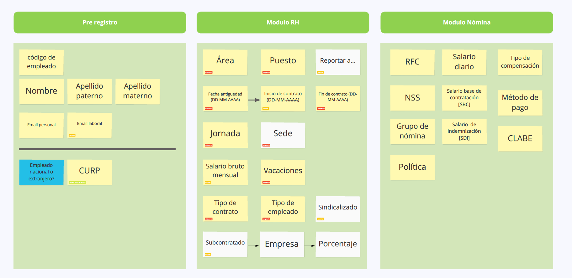
To understand better the problem, different sessions were scheduled with payroll experts, fo this, an interview stage was planned followed by a card sorting activity with two purposes: Know the grouping and the importance of each piece of information.
USER EXPERIENCE
Once having clearer the panorama in which we find ourselves we define contemplate 4 actionable that will help us to fulfill the objective.
USER JOURNEY
Here we find a small stopper because, for the first time an employee is registered, it is still not possible to assign a person in charge and you cannot assign roles without having employees so it becomes an endless cycle, so it was proposed not to show the data from "report to" in a first record.
**THIS IS AN EXAMPLE OF WORKFLOW FOR PAYROLL IN MEXICO, IT MAY VARY DEPENDING ON THE OFFICE AND THE PAYROLL SPECIALIST.
INFORMATION ARCHITECTURE
The information architecture was restructured to standardize the registration of an employee, the result is 3 modules, which will be shown depending on the contracted services. It was reduced to a total of 32 data of which there will only be 11 open fields, most in the pre-registration.
USER FLOWS
The proposal is to stop using external layouts to generate massive employee registration from the application. Dependence on the modules and services contracted was considered a priority, as well as the actions of edition and massive elimination.


USE CASE DIAGRAM
It allows us to objectively know the actions to be carried out in a flow, it could be said that it is the description of activities that must be followed to give way to a process, in this case the individual or massive registration of employees.
UI DESIGN
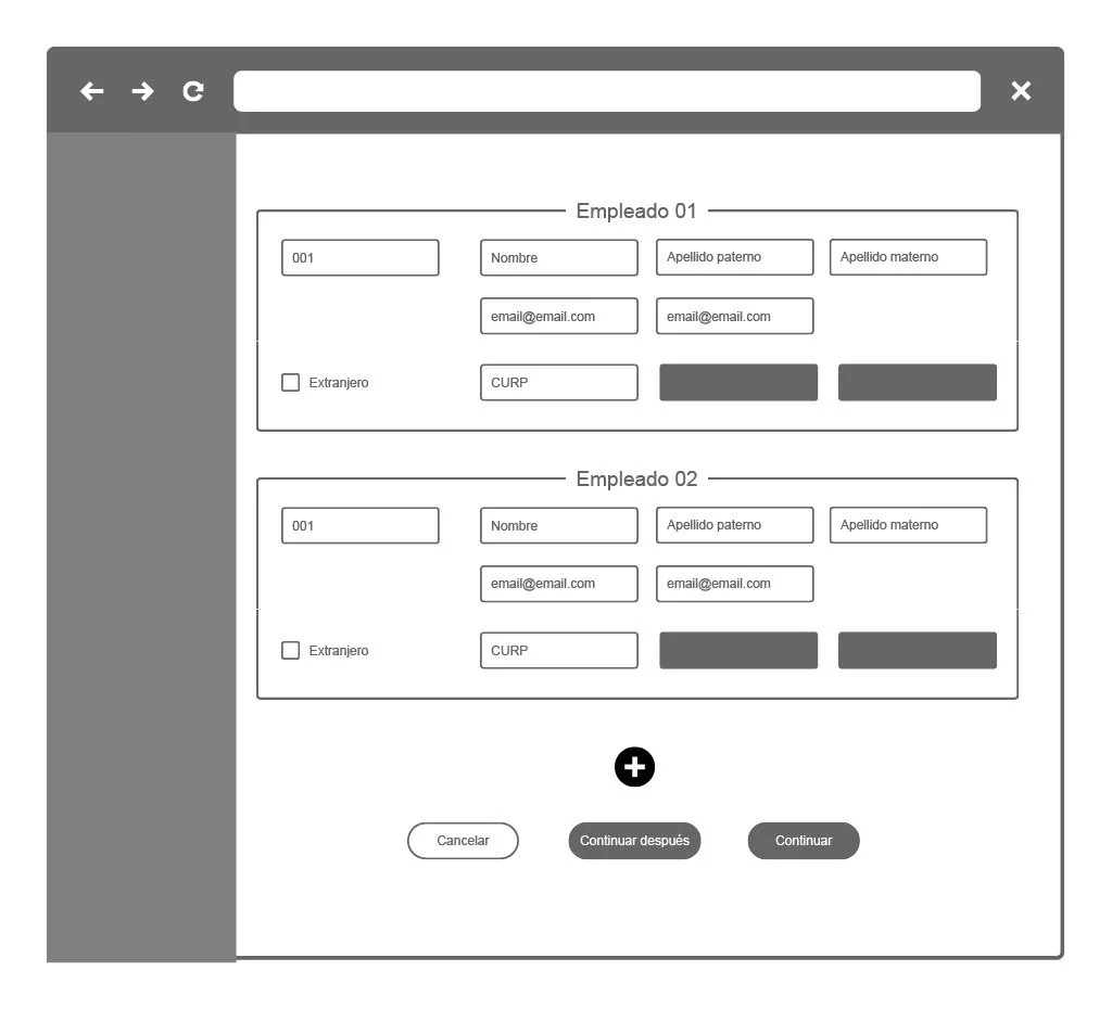
The platform has a complete library that maintains consistency in the visual and experience in all flows. The challenge we faced was to present a functional and pleasant experience towards the massive load, so we did a search for proposals that had an acceptable visual and experience. Finally, we download our ideas in wireframes to bring our stakeholders and get quick feedback.
WIREFARMING
This is property of Runa - Payroll platform, they authorized me to share some information of the project.
SCREENS
After the refinement of the wireframes, the product team generated a new objective which is to emphasize the massive process to be applied in more flows such as cancellations, data updates, etc. For this reason, some modifications were made in the final proposal, so that it was adaptable to different situations.
* THE FOLLOWING PROJECT WAS CARRIED OUT FOR A FIN-TECH COMPANY RELATED TO PAYROLL PROCESSES IN MEXICO, 2020. ALL THE INFORMATION USED IN THE MOCKUPS IS FICTITIOUS.


LEARNINGS
THINGS TO IMPROVE
Have a better definition of the project to be covered, not just conjecture, approach project leaders and understand the dependencies that may exist.
Involve stakeholders from the research steps and make constant reviews with the product team.
THINGS THAT WORed
Everything was documented from the beginning and this helped us to iterate more efficiently.
We involved other areas (payroll experts) during the understanding process and this was of great value.
Maintain follow-up with development for the validation of proposals so that the proposal is viable and that they can structure their work plan.


